
DURATION
10 weeks
SCOPE
UX Design
Visual Design
Product Thinking
User Research
Interaction Design
TOOLS
Figma
Adobe Illustrator
Adobe Photoshop
InVision
Pop by Marvel
Overview
In this project, I wanted to focus on the realm of physiotherapy and massage therapy; a subject that has captured my attention for the past 2–3 years. With the pandemic-induced lockdown in Toronto in 2020, many individuals resorted to working from home, which led to an increase in back pain, stiff necks, and overall body discomfort. I was curious to explore the effects and consequences of prolonged desk-bound work, as well as how people were managing these often-overlooked health concerns.
THE PROBLEM
Navigating health-related information and solutions online can be a daunting and confusing task.
HYPOTHESIS
Aspiring young professionals seek convenient means and expertise to enhance their physical well-being, and my preliminary research will confirm this as I aim to provide a user-friendly solution to their search for health information.

Design Process
To streamline my approach, I utilized the Double Diamond and Design Thinking frameworks. This strategy facilitated both convergent and divergent thinking, enabling thorough idea generation before narrowing down to focused action. These four stages were pivotal in guiding my creative process.
Understanding Target Audience
Through primary and secondary research as well as interviews, I sought to explore the physical impact of extended desk work on young professionals and confirm the viability of a possible solution.
Seconday Research
How might we help young professionals strengthen, recover and prevent injuries, caused by working at a desk for long periods of time?
Primary Research
My goal in conducting these interviews/surveys is to gain insight into the work from home experience, including participants' work habits and home office setups. By gathering this information, I hope to empathize better with those I am designing for and create products that meet their needs.
Interview Synthesis
Through conducting 4 interviews and 5 surveys, I identified key themes, pain points, and behaviors related to the work from home experience. These insights have enabled me to develop personas that represent the needs and experiences of remote workers.
Insights:
An alarming 75% of participants reported inadequate home office setups.
Half of the participants reported overworking, neglecting, or forgetting to take necessary breaks.
Although information is readily available on the internet, many individuals remain skeptical of its accuracy and reliability.
Every participant emphasized the significance of seeking regular care from physiotherapists, massage therapists, and chiropractors.
Customization emerged as a key priority for participants, who underscored the importance of tailored products, services, and experiences.
Primary Persona
Who am I designing for? Based on the synthesized themes and insights I organized, I was able to create a ‘primary’ persona that would best represent users who would benefit from a digital solution to improve their physical health and overall life.
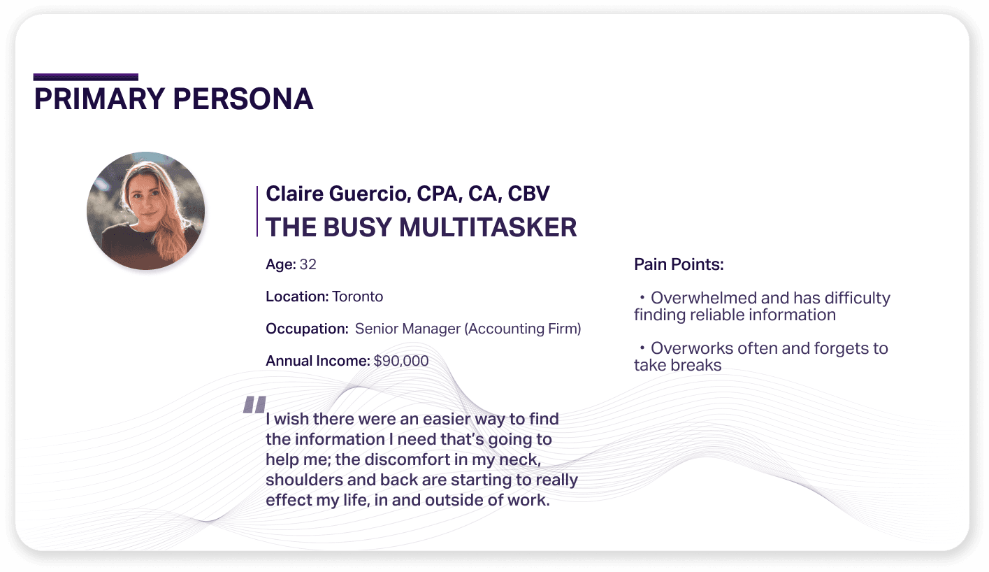
Claire Guercio
Claire is the best representation of someone who doesn’t have a proper office setup, feels overwhelmed when searching for health-related information, stresses the importance of customization, and seeking professionals (example. massage therapists) regularly. These are all key themes.

Experience Map
For myself to better understand the problem space that I’m solving for, I designed an experience map that lays out the journey that a user may take to reach a solution. By doing so, I was able to visually see the highs/lows of the journey and pinpoint key moments where my solution can improve a user’s life.


Exploration + Sketches
I was determined to create an app that users could navigate with ease. Drawing inspiration from popular apps, I combined familiar patterns and layouts in hopes of reducing confusion and increasing usability. Through careful experimentation and analysis of user stories, I honed my design approach in an attempt to achieve maximum clarity and effectiveness.

Mid-fi Wireframes
With the foundation in place, I transitioned to wireframing the primary task flows in Figma. After creating a mid-fi prototype, I conducted two rounds of user testing with a total of 10 participants, gathering valuable feedback to improve the app's usability.
Throughout the process, I embraced experimentation and learned the value of leveraging existing design patterns to avoid confusion. Above all, I recognized the importance of putting the user at the forefront of every design decision.
Mid-fi vs Hi-fi Screens
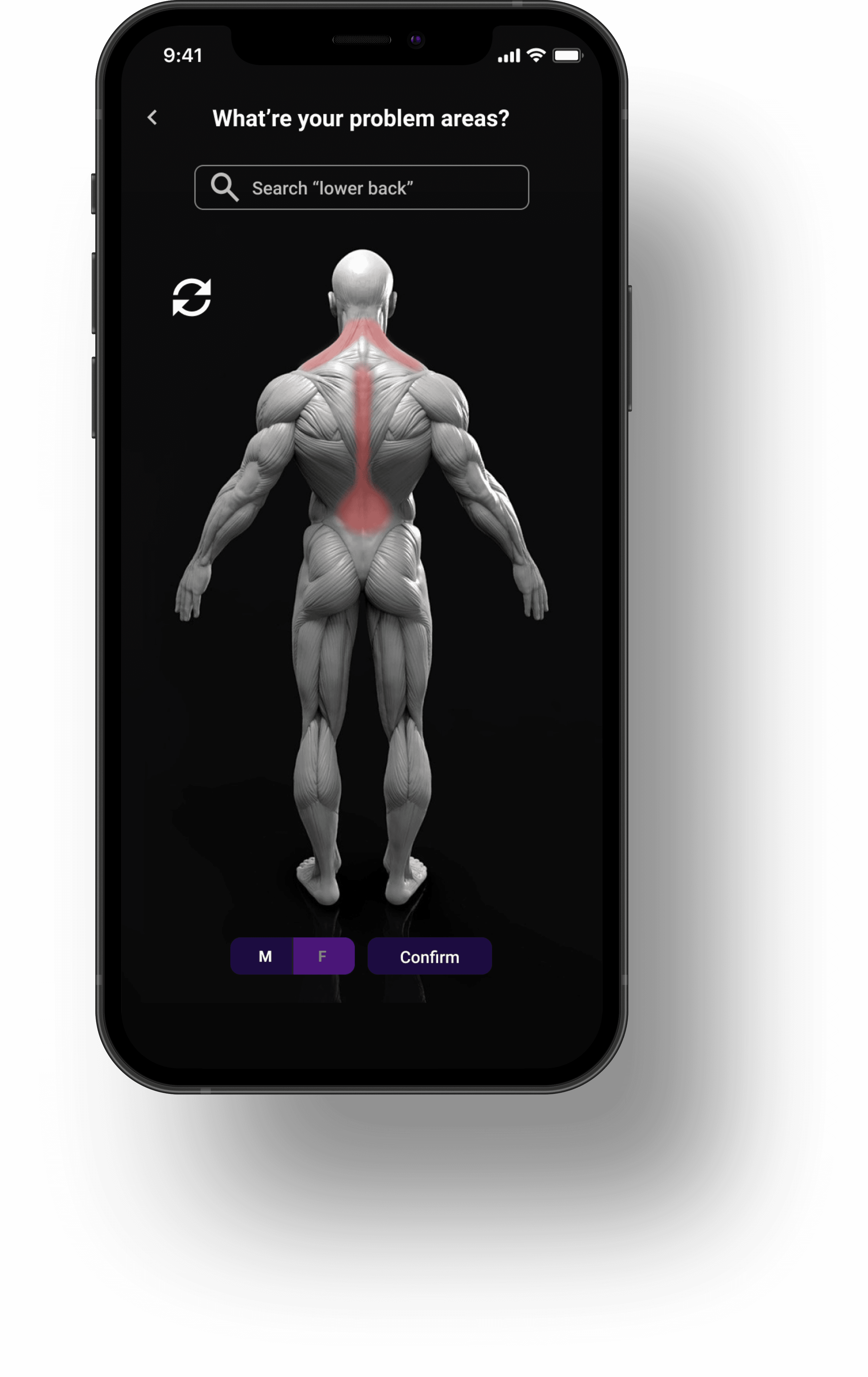
Usability tests revealed that users were struggling with the app's core feature, the profile customization page. The design was deemed dull and unappealing, and the placement of the 'confirm' button caused frustration, especially for users like Claire, who prioritize efficiency. I sought advice and revisited my sketches, resulting in a streamlined process featuring an interactive human anatomy on a muscular level. While women's anatomy and skeletal system were not included due to time constraints, they remain valuable additions for the future.
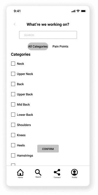

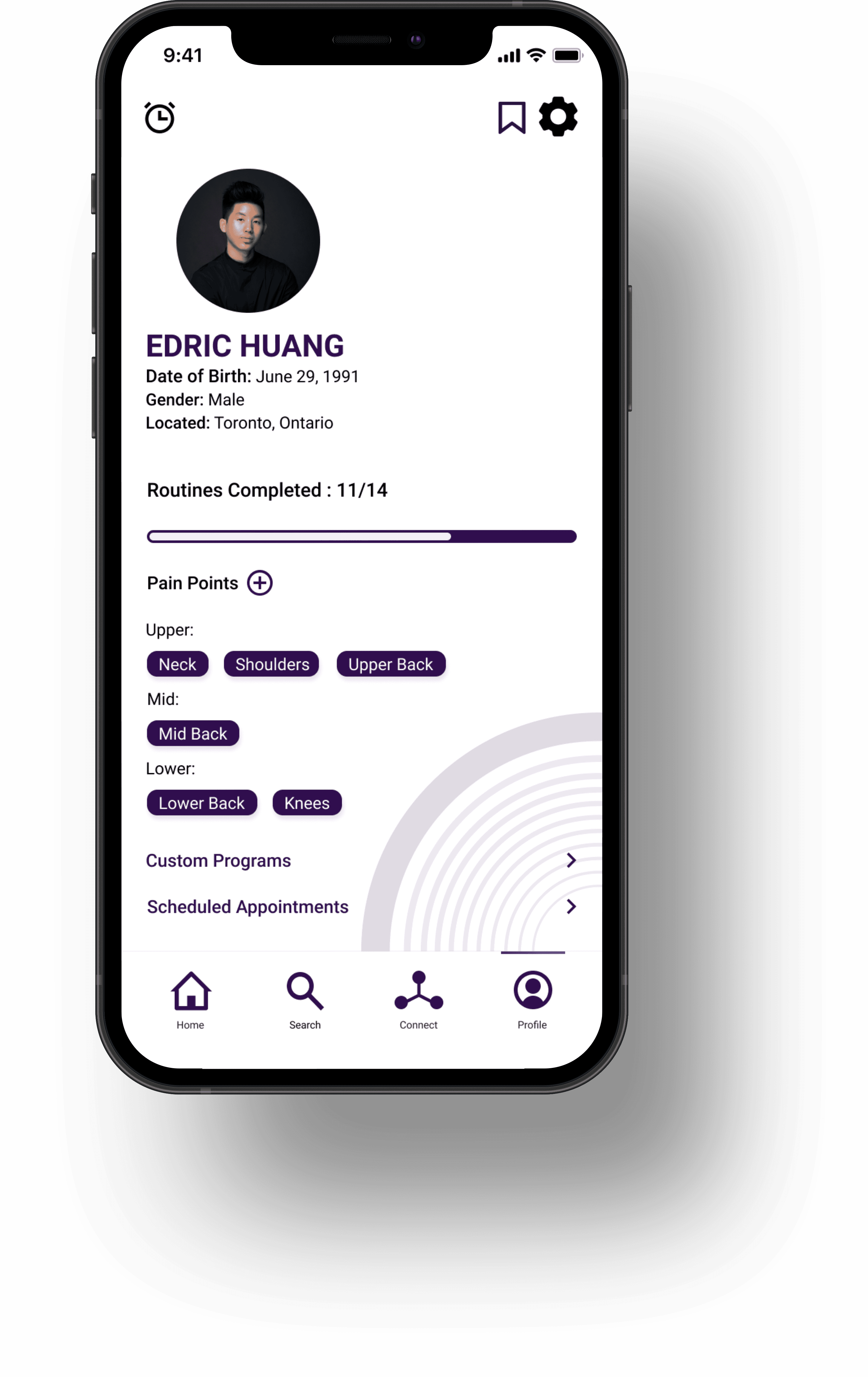
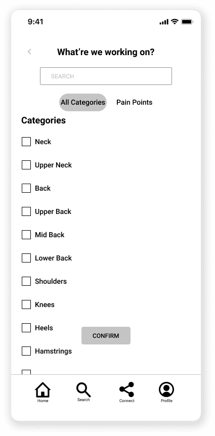
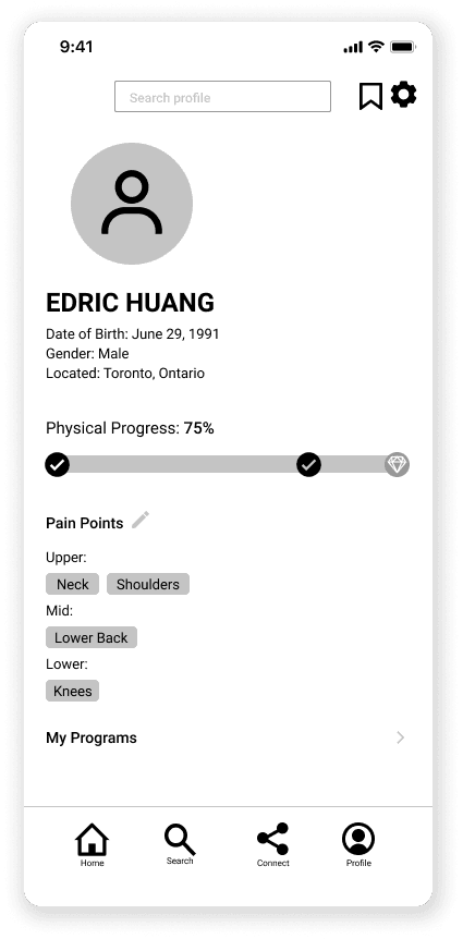
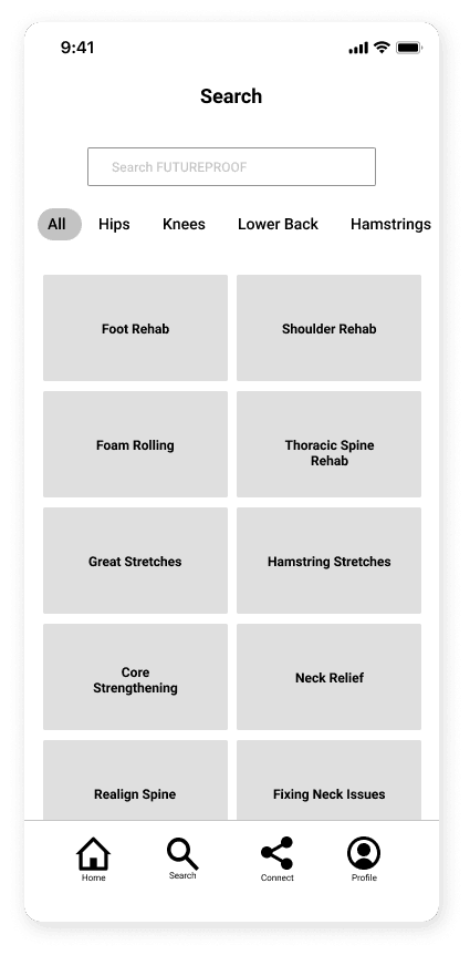
User Customization (Tailored Experience)
During my research, I discovered that personalization is a key factor for many users. To meet this demand, I integrated a feature that allows users to select the part of their body experiencing discomfort. By leveraging AI and machine learning, the app generates customized information that is credible and relevant to each user.
While the feature was a success, I recognized that there is always room for improvement. In hindsight, I would have included additional questions in the onboarding process to enhance the overall user experience.
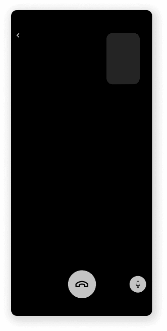

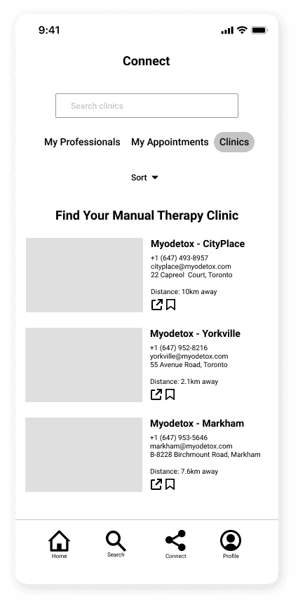
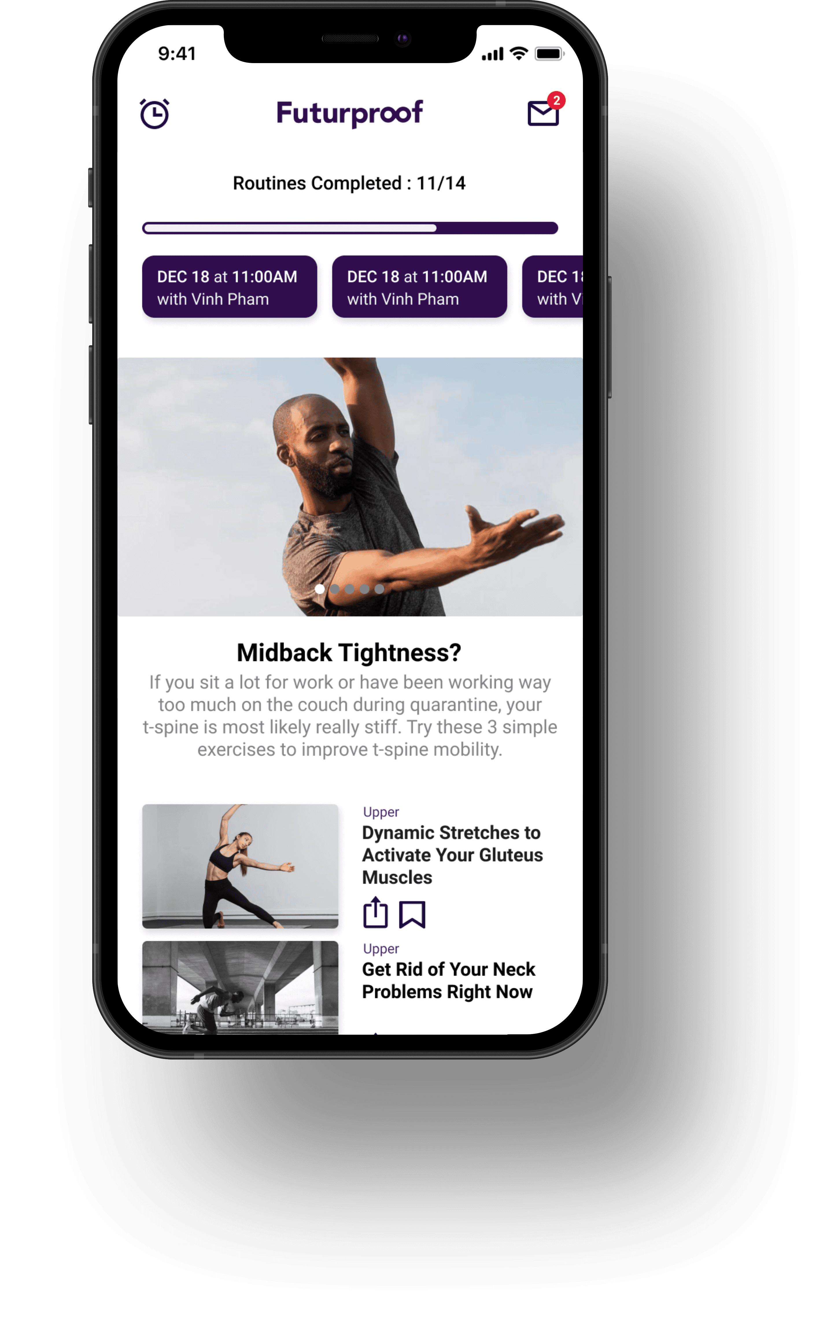
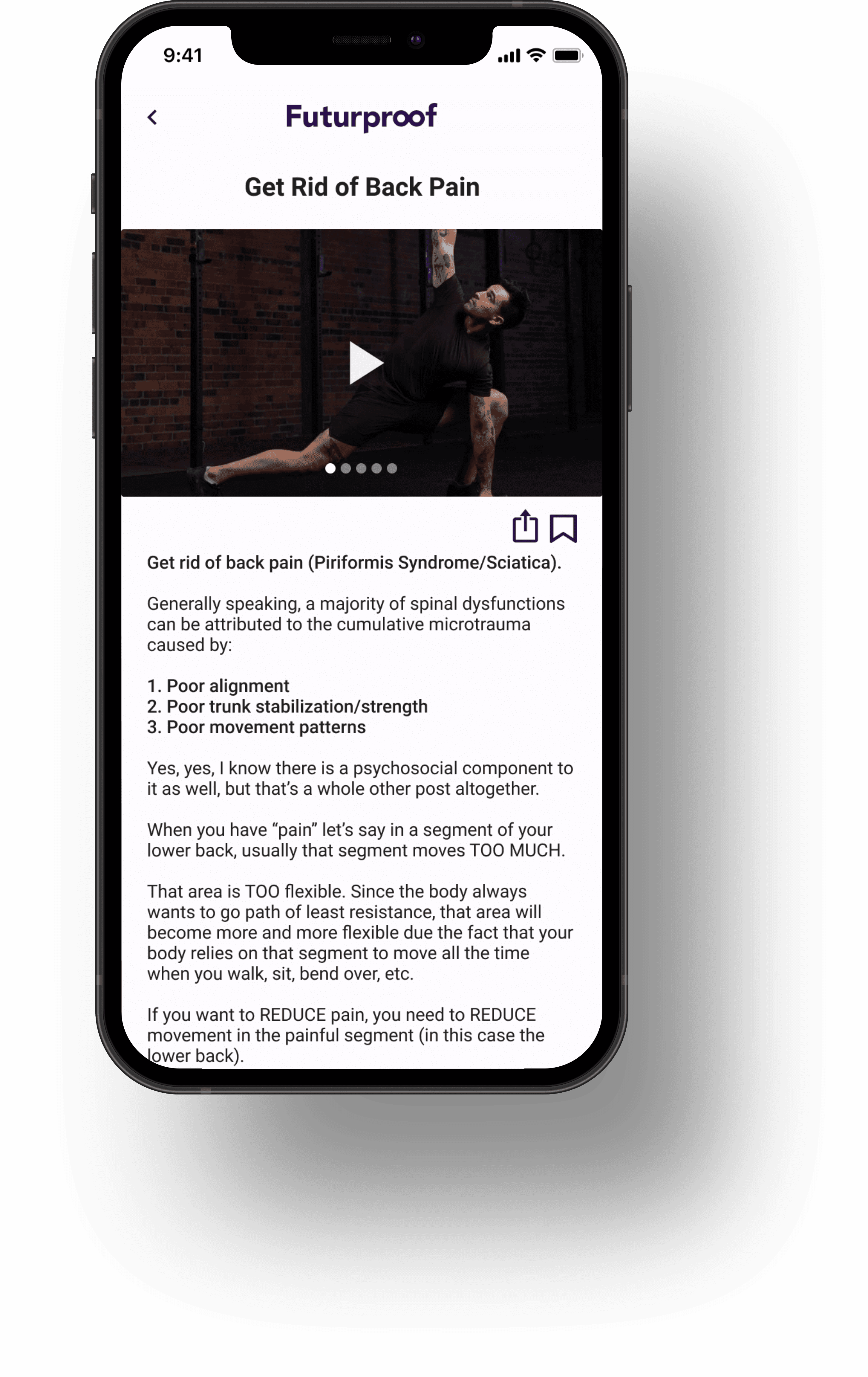
Connecting With Professionals (Reassuring Users)
My interviewees stressed the significance of seeking advice from experts such as physiotherapists and massage therapists. To fulfill this demand, I integrated a feature that furnishes users with credible information and personalized plans for a comfortable lifestyle. This proved especially beneficial during the pandemic, as virtual solutions gained importance.


Stretch Notifications
During my research, I discovered a common behavior among interviewees: losing track of time while working and neglecting to take necessary breaks. To address this issue, I implemented a timer that reminds users to pause and complete recommended stretches at regular intervals. This feature encourages healthy habits and helps users maintain productivity throughout the day.
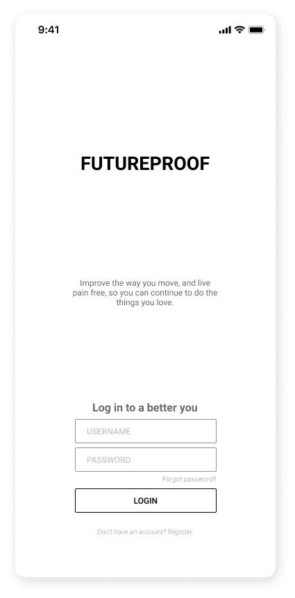
Visual Branding
After thorough research, audience identification, and wireframe development, the moment had arrived to breathe life into our screens through the artistry of colour and branding.

Moodscape
Futurproof is a brand that feels modern, clean, and strong while also promoting healing and calmness. We kept words like "essential" and "dependable" in mind while creating the visuals. My mood board was thoughtfully crafted to make a lasting impression.
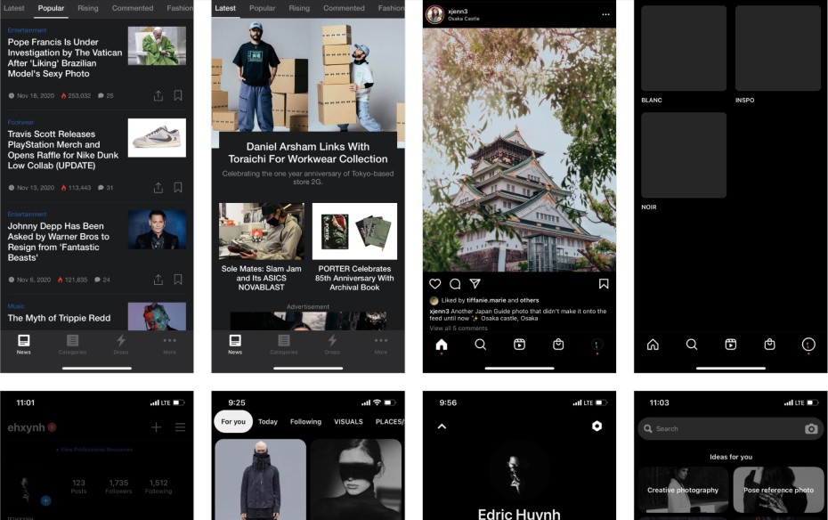
UX/UI Inspiration Board
As I searched for UX and UI inspiration, I prioritized exploring popular apps to create a sense of familiarity for users. By doing so, I aim to provide an intuitive experience that users can easily connect with.
WORDMARK

APP BADGE
The Wordmark + App Badge
When ideating and designing this wordmark, the idea of stopping something or someone from aging/deteriorating comes to mind when I thought ‘Futurproof’. Keeping that in mind, an infinity symbol was created with the two ‘o’s’ in Futurproof. Simple, effective, and clean.

#1COC40, #300E4E, #4B1678, #F3E9FB
Colour Palette
With Futurproof, I chose a monochromatic purple colour palette that draws inspiration from the tranquillity of dusk and dawn. This calming colour also represents attributes such as wealth, wisdom, independence, devotion, and peace. By incorporating these elements into the branding, I strived to create a trustworthy experience for users.


The Climax
This solution offers customized profiles, tailored information, and connections with industry professionals, making it a life-improving option. Say goodbye to the hassle of searching for remedies to physical pains online. Plus, I discovered a new development process and created the solution in record time.
Success Metrics
To measure the success of this hypothetical product, there are several key metrics that would need to be focus on. Firstly, user engagement, measured by page views, video views, and time spent on the app. Secondly, usability, assessing the ease of accessing features, functions, and success rate (such as creating customized plans). Thirdly, user retention metrics and modifications based on the onboarding process, "user error rate" and "conversion rate" are crucial. Ultimately, user reviews should reflect these metrics.

Additional Utility
Futurproof would be a great fit for the Apple Watch, known for its health-tracking features. As technology advances, it may be possible to track more than just sleep and heart rate, including inflammation. A timer/notification to remind users to stretch would also benefit individuals like Claire and Joseph in reaching their goals.
Key Learnings
What did I learn?
During this project and program, I discovered my ability to acquire and apply a vast array of skills and knowledge within a short timeframe. Despite tight deadlines, organizing and planning with a work-back schedule was the key to success, while also keeping in mind that "done is better than perfect." I found the end-to-end design process fascinating, especially observing how people think and interact. I gained a newfound appreciation for the crucial role that research plays in design, ensuring that design decisions are made with purpose. It's essential to remember that visually appealing design may not always be functional, and designing for users' needs should always be the priority.
What would I do differently?
To enhance familiarity and reduce confusion, my design approach drew inspiration from popular apps and digital solutions. However, in hindsight, I would have loved to explore pushing the boundaries of human interaction to visual design during the ideation and sketching phase. To improve the user experience, I would implement questions in the onboarding phase to understand the users' needs and pain points. Additionally, I would simplify the app by removing unnecessary pages/features and focusing on key features to provide a seamless experience for users.