
DURATION
2 weeks
SCOPE
UX Design
Visual Design
Product Thinking
User Research
TOOLS
Figma
Overview
Ever wonder why collaborating on Pinterest isn't as smooth as it could be? Imagine clicking through images just to find out who pinned them. Plus, pinners' details often get buried under comments (in case there are any). But what if we flipped that script?
Picture this: A Pinterest where you instantly get a sense of everyone's interests, keeping that clean look intact. You'd follow the evolution of ideas seamlessly and reduce confusion. And hey, less screen time and stress might be nice bonuses too. Ready to dive in and discover more?
THE CHALLENGE
Optimizing the Pinterest experience for collaboration by addressing issues like cumbersome navigation to identify pinners.

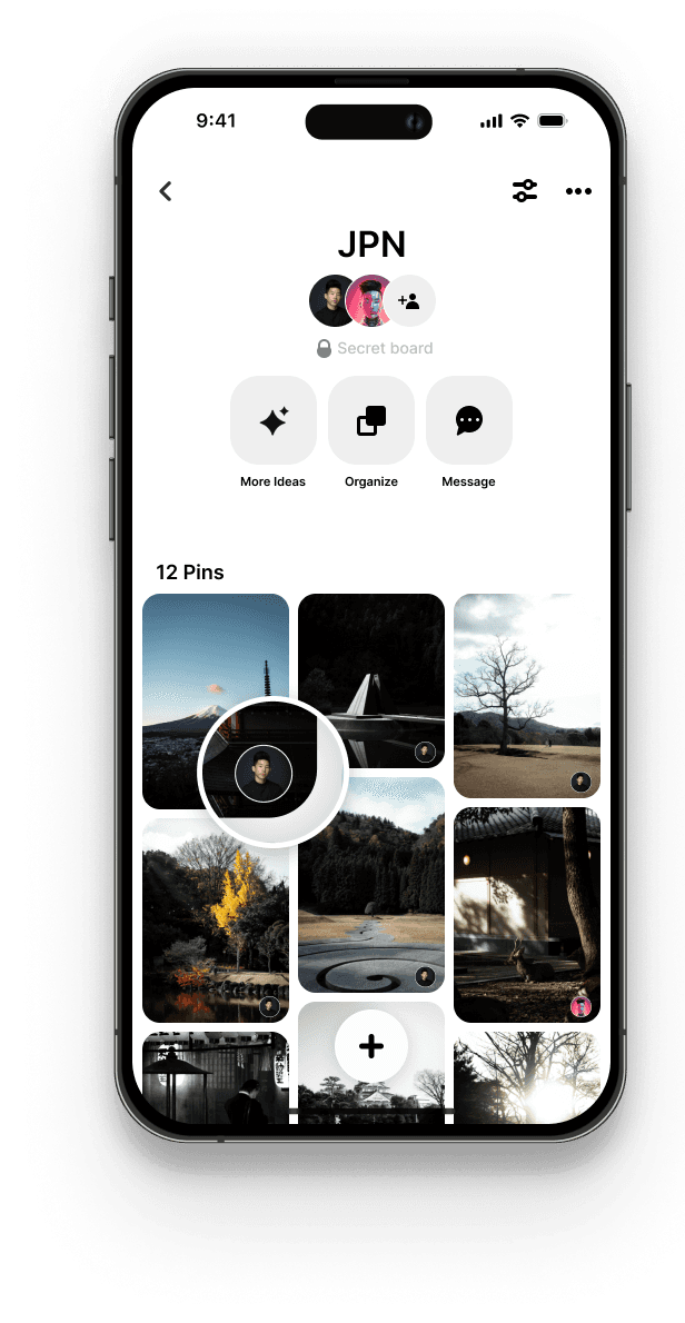
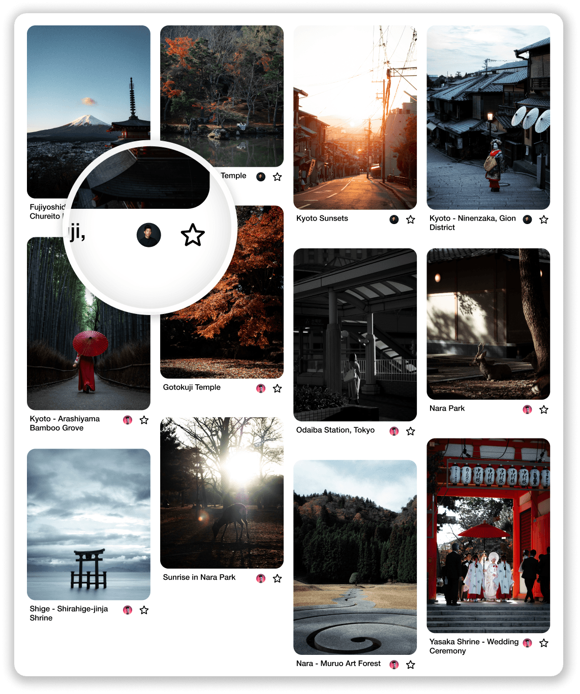
MOBILE V1 (BEFORE)
Why isn’t the current design as enjoyable of an experience for collaborating as it could be?
Consider managing multiple collaborators and needing to click into each image to identify the pinner.
Pinner’s information should ideally appear before any comments, but at the moment, it tends to get pushed to the bottom.
It's not easy to quickly understand each other's interests, which results in wasted time.
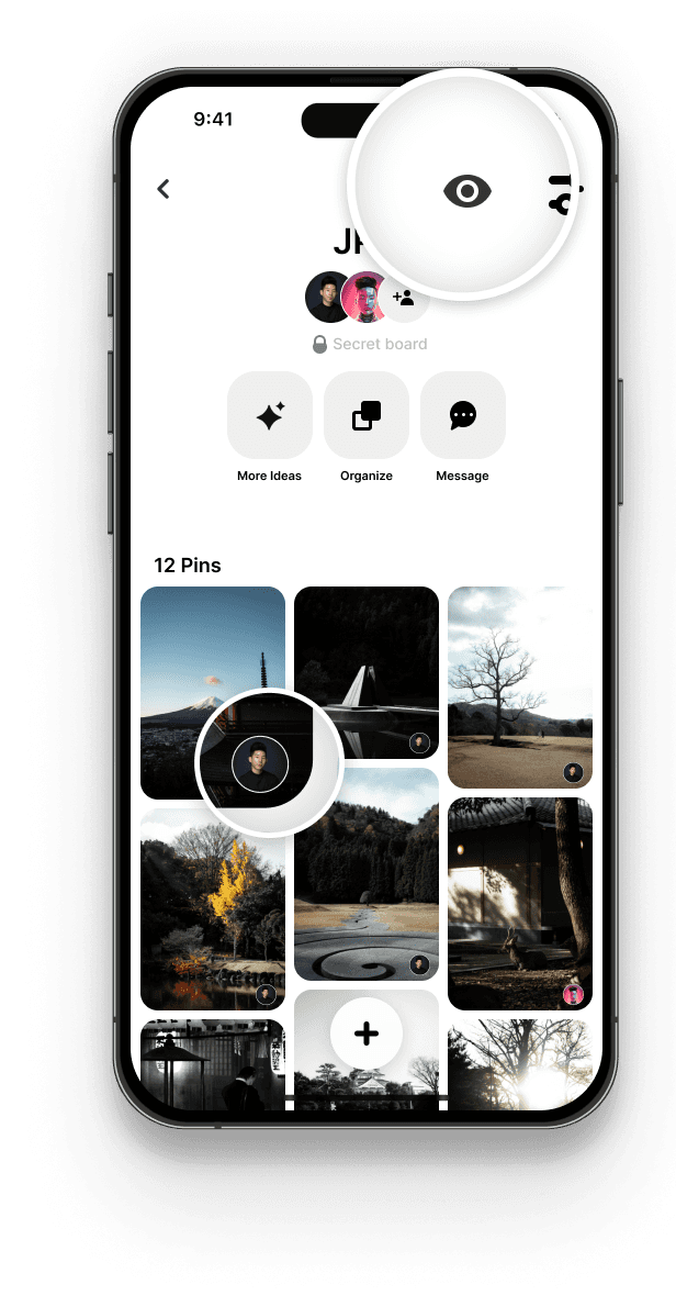
MOBILE V1 (AFTER)
How would this change positively impact Pinterest users when collaborating?
Streamline the process of understanding people’s interests.
Preserve the neat Pinterest aesthetic.
Facilitate understanding of the collective vision's evolution.
Introduce an optional addition to the current user flow to prevent confusion.
Encouraging less screen time.
Alleviates stress and anxiety.
How would this experience translate
over to browser?
BROWSER V1 (BEFORE)


BROWSER V1 (AFTER)

Why is this project impactful to Pinterest?
Enhancing collaboration on Pinterest not only simplifies idea-sharing but also increases user satisfaction, attracts more users to utilize Pinterest as a collaboration tool, alleviates stress and anxiety, fostering prolonged engagement (cultivating loyal customers).
What if we took a different approach (V2)?

MOBILE V2 (AFTER)
Further simplification, but is the tradeoff worth it?
Pros
The process is streamlined even further from V1, achieving the same results with fewer steps, which allows for quicker understanding of people's interests.
Cons
Users may need time to adapt to this new flow or pattern.
The presence of three buttons in the top right corner could create clutter (might be particularly noticeable on boards with long titles).
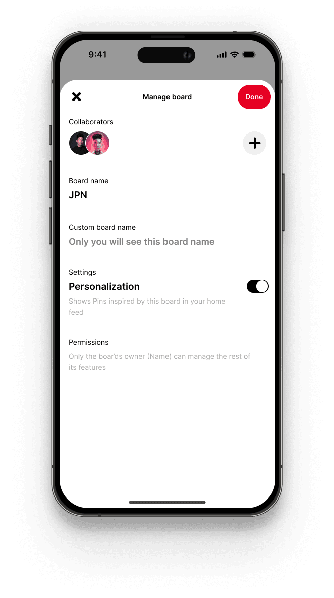
ADDITIONAL OPPORTUNITIES

BEFORE
AFTER
Arrange it as you like, tailored to your preferences.
Cater to everyone's unique organizational patterns.
A new section labelled “Custom board name” could allow collaborators to adjust to better fit their organizational system.
At the moment, only the creator of the board can change the name.